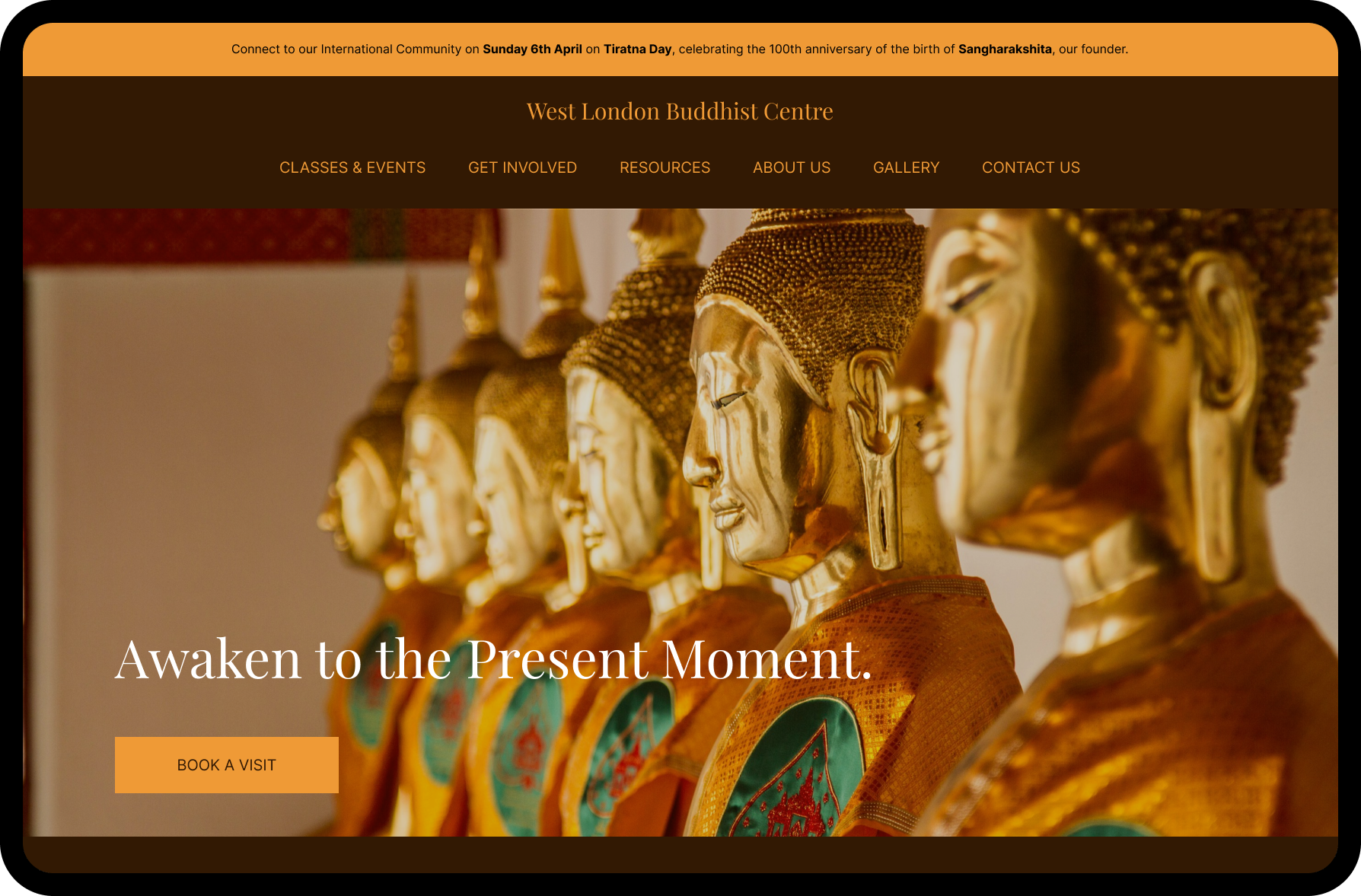
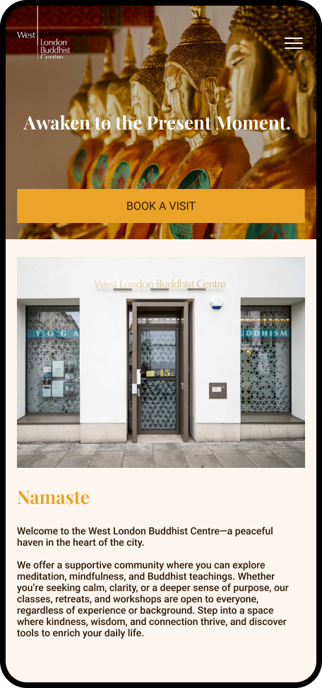
Improving event visibility and increasing bookings.
HOMEPAGE REDESIGN
2025
Tags: UI/UX Design | Homepage | Mobile responsive
Tools: Figma, UnSplash, Squarespace
Project Goal: Redesign the homepage experience to feel calmer, clearer, and more welcoming for first-time visitors while improving discovery of classes and events.
West London Buddhist Centre
The Challenge
The original homepage contained useful information, but the experience felt text-heavy and difficult to scan. Important actions like exploring courses or booking events lacked clear hierarchy.
Focus Areas:
Simplify navigation
Improve visual hierarchy
Create a calmer first impression
Make classes and events easier to discover
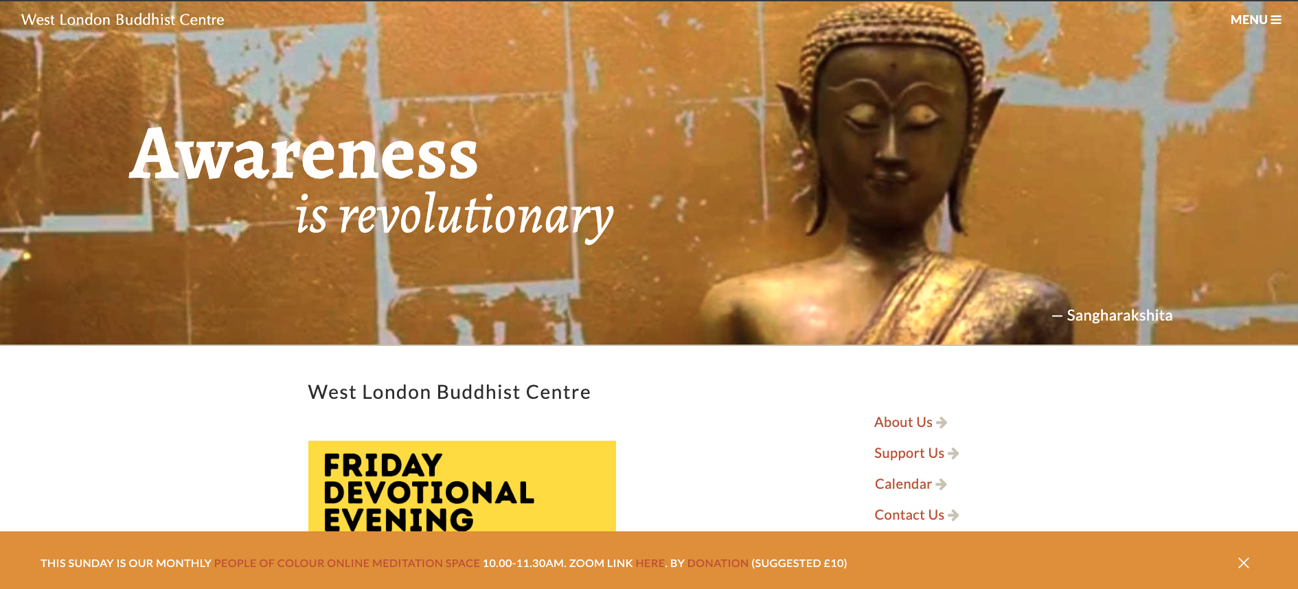
Original hero and navigation above the fold on desktop.
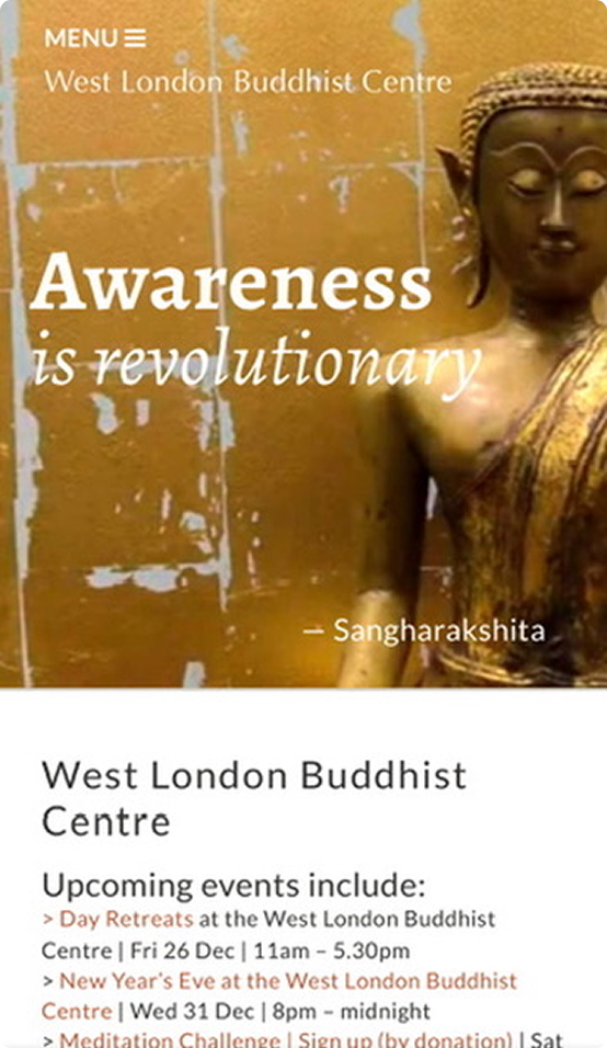
Original hero and navigation above the fold on mobile.
User Testing
User Test Summary - Homepage (5 participants)
Objective
Evaluate homepage usability and identify areas for UX improvement.
Method
Five users completed short tasks such as finding events, contact details, and service information. Success rates, time-to-find, and feedback were recorded.

Key findings
Most users completed tasks successfully, though one struggled with navigation flow.
Navigation labels caused confusion between Events and News sections.
Event listings were only easily found when prominently displayed.
Contact details were eventually located by all users, but felt hidden.
Long text sections were often skipped in favour of headings and visuals.
Stronger contrast and clearer hierarchy improved scanning and CTA visibility.
Some mobile content was missed due to excessive scrolling.
User feedback
“I’m not sure if events are under News or What’s On.”
“The contact link feels tucked away.”
“A quick summary would help instead of long paragraphs.”
Recommendations
Clarify navigation labels and content grouping.
Make events and contact CTAs more prominent.
Replace long text blocks with concise summaries or service tiles.
Improve visual hierarchy, contrast, and mobile layout.
Conduct a follow-up usability test after redesign.
Conclusion
The test highlighted clear opportunities to improve navigation clarity, content scanning, and CTA visibility, helping create a more intuitive homepage experience.
Design
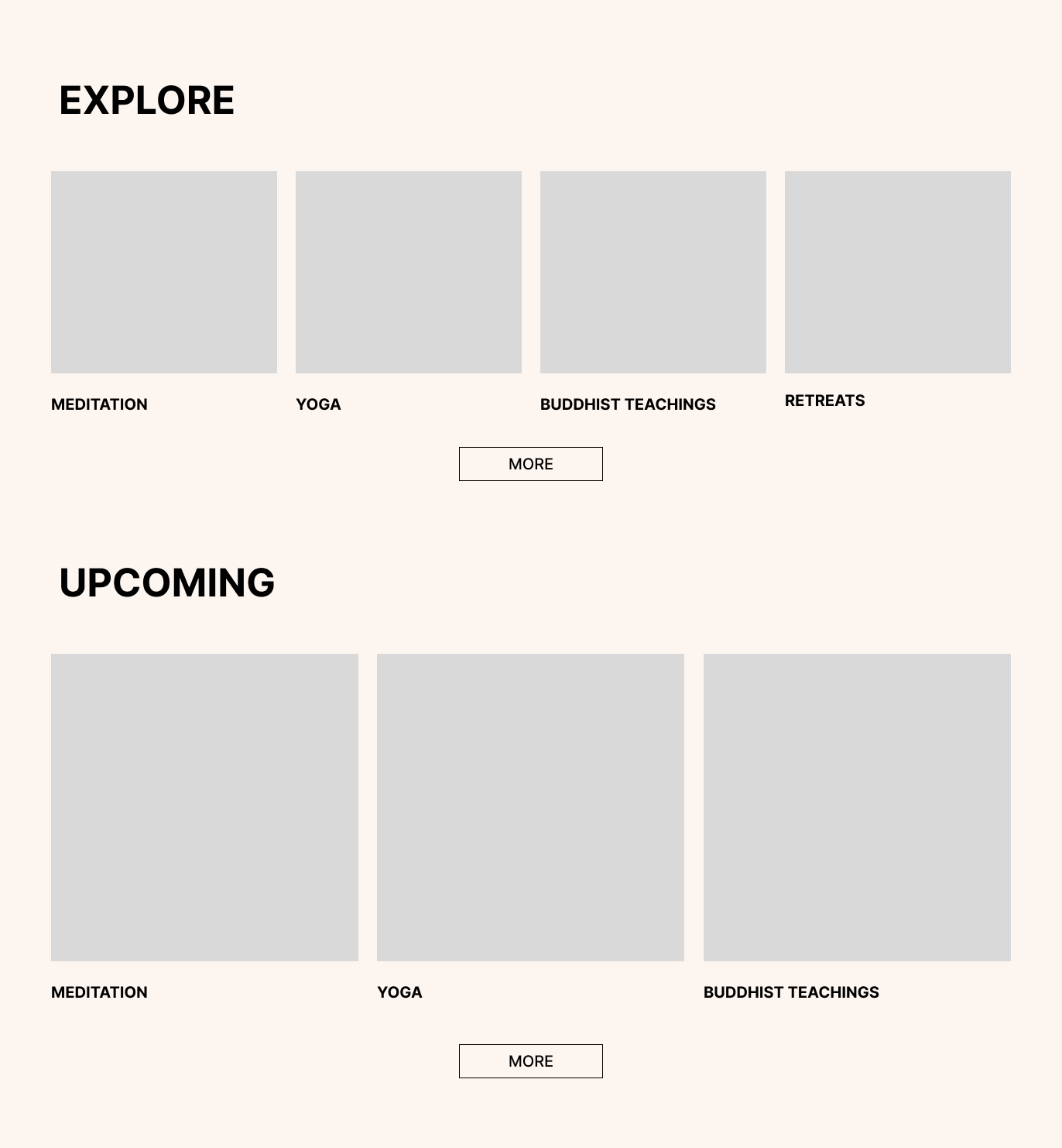
I restructured the homepage using a more modular layout system with clearer content sections, stronger typography hierarchy, and more intentional spacing.
My thought process was that as humans, we scroll text and imagery in blocks and sections in order to absorb information quickly.
Someone new to the practice may just want to know more about retreats, so removing extra text helps them get to their goal easier. the user sees the subheading and the accompanying image.
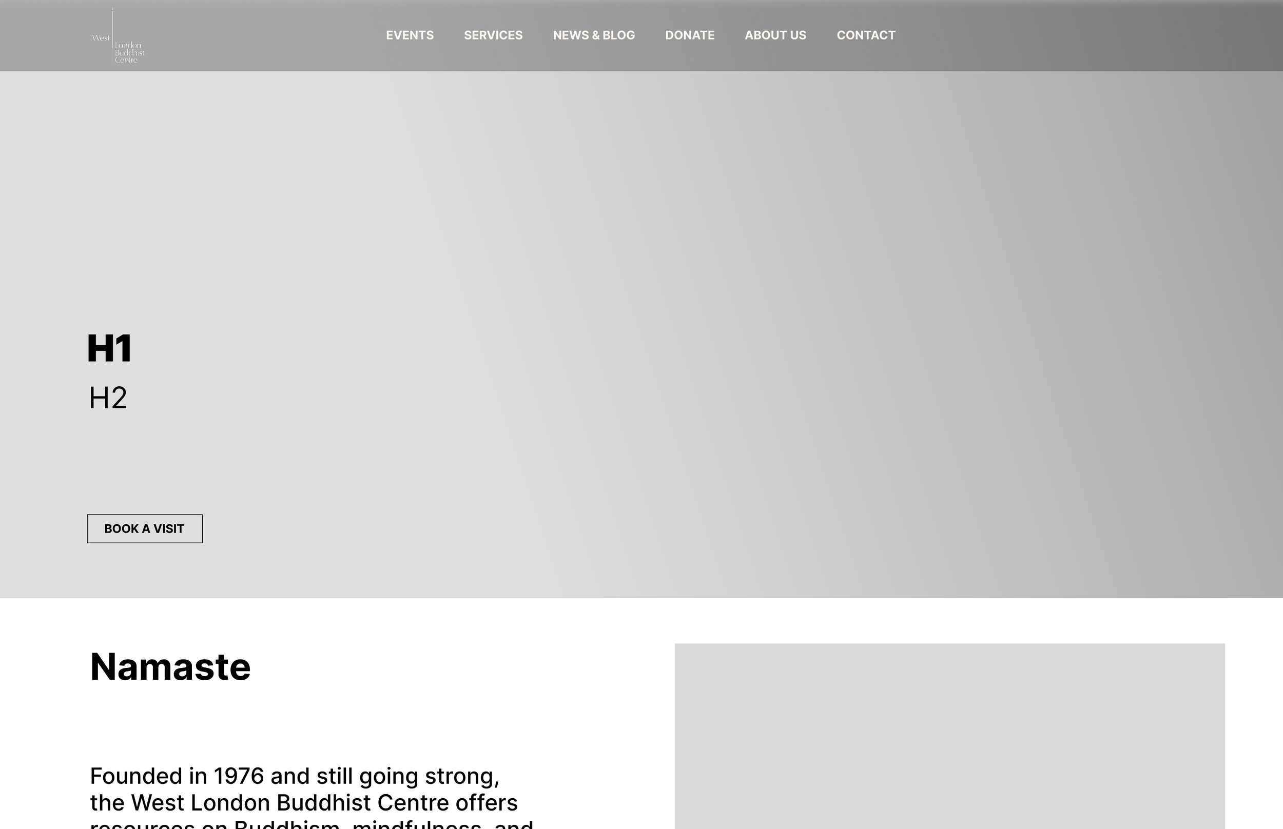
Mid-fid wireframe of hero section on desktop.
Reduced colour palette
The old website had a number of colours that were very similar, and had low colour contrast.
I chose instead to make the palette warmer, slightly simplified to ensure a more memorable tone for the branding.
Inspiration came from traditional Buddhist Monk attire, and the colours of spices like turmeric, and red chilli powder.
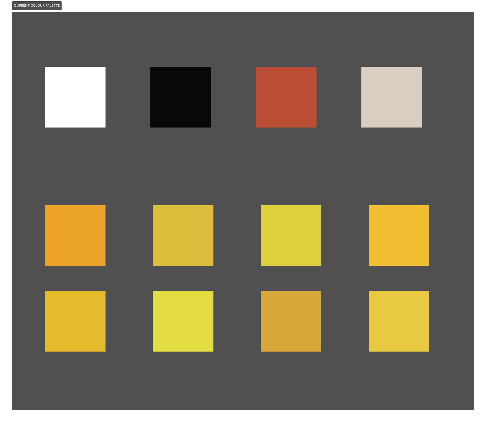
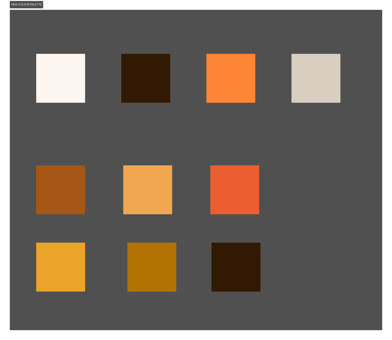
The visual direction was inspired by the peaceful atmosphere of the physical centre, using:
Soft, neutral colour palette inspired by buddhist monk attire
Calm, readable typography with clear hierarchy
Minimal imagery used intentionally to support tone
Accessibility considered through contrast and spacing
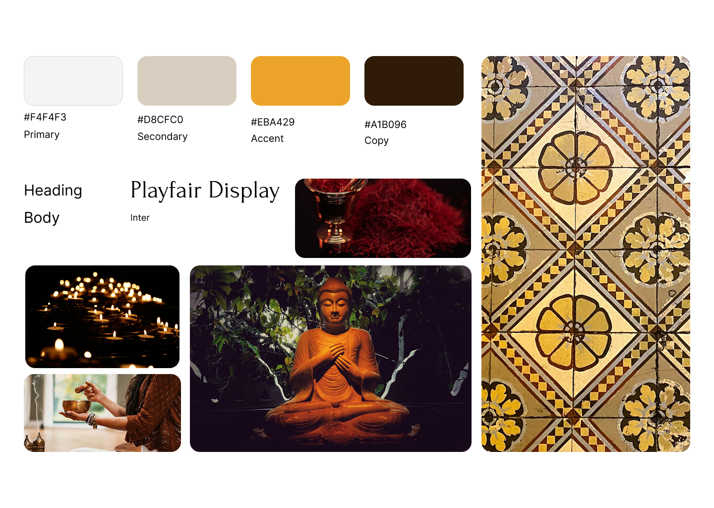
Moodboard
Final Design
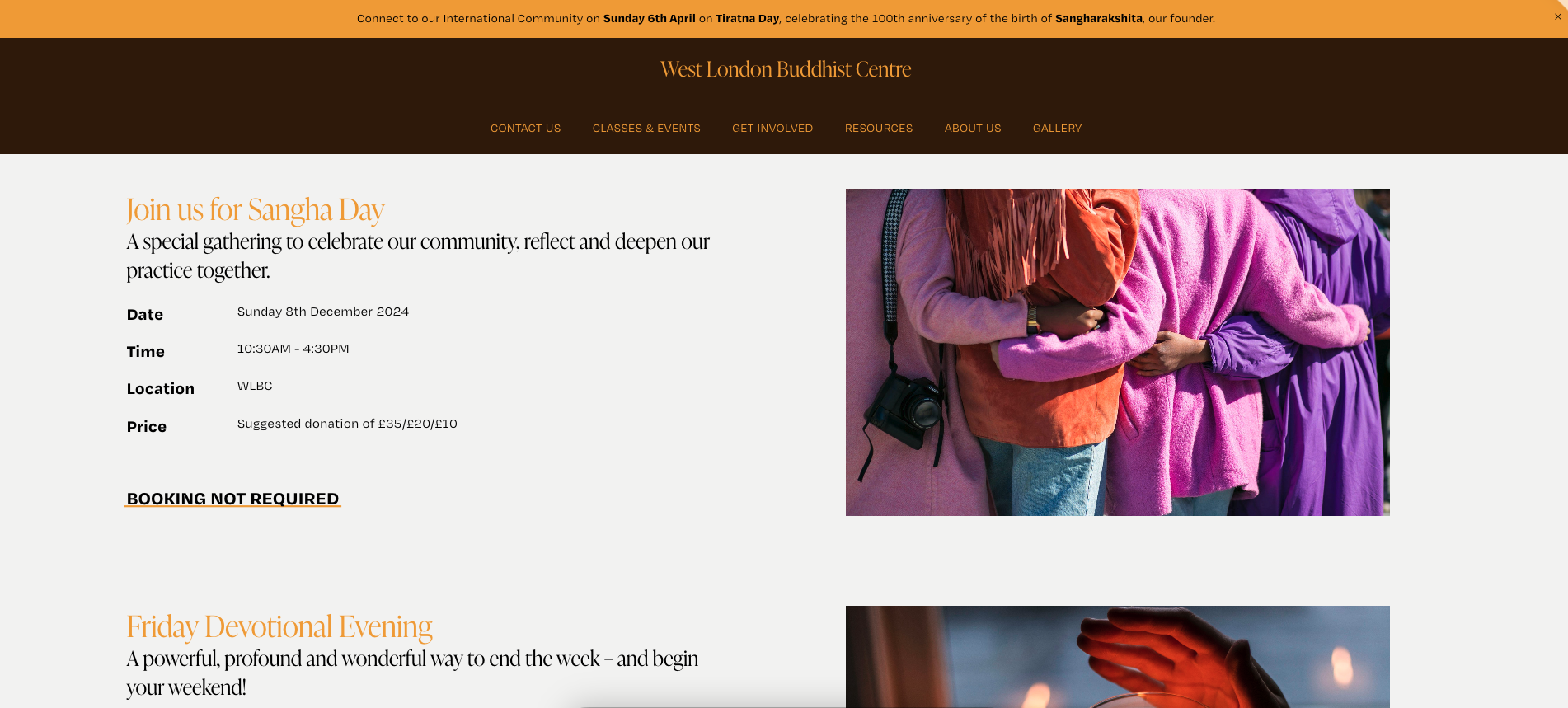
The redesigned homepage creates a more approachable and intuitive experience for new visitors.
Key improvements included:
Clearer call-to-actions
Dedicated event sections
Simplified navigation
Card-based layouts for easier scanning
Improved mobile responsiveness
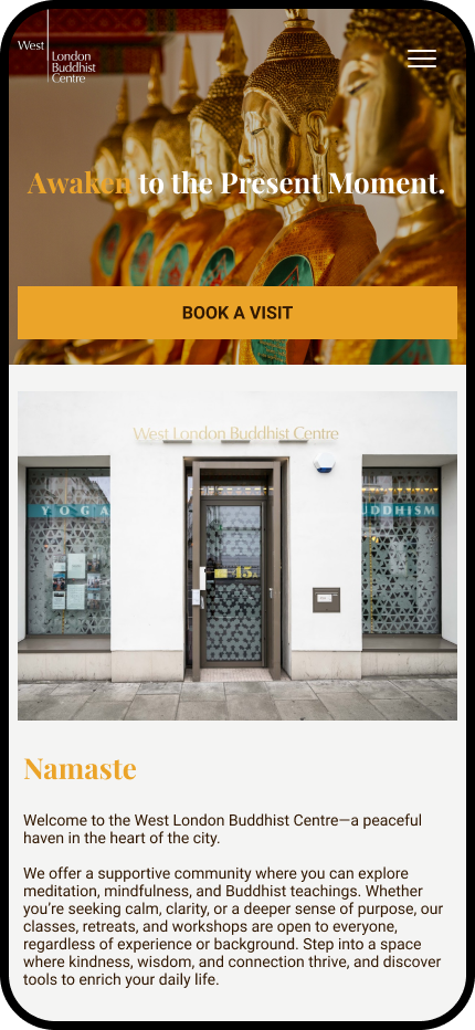
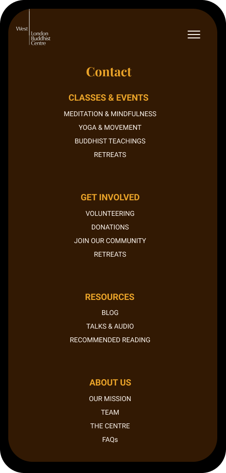
The user can now see upcoming events at a glance in a way that offers an overview with key information: what, when, where, how much.
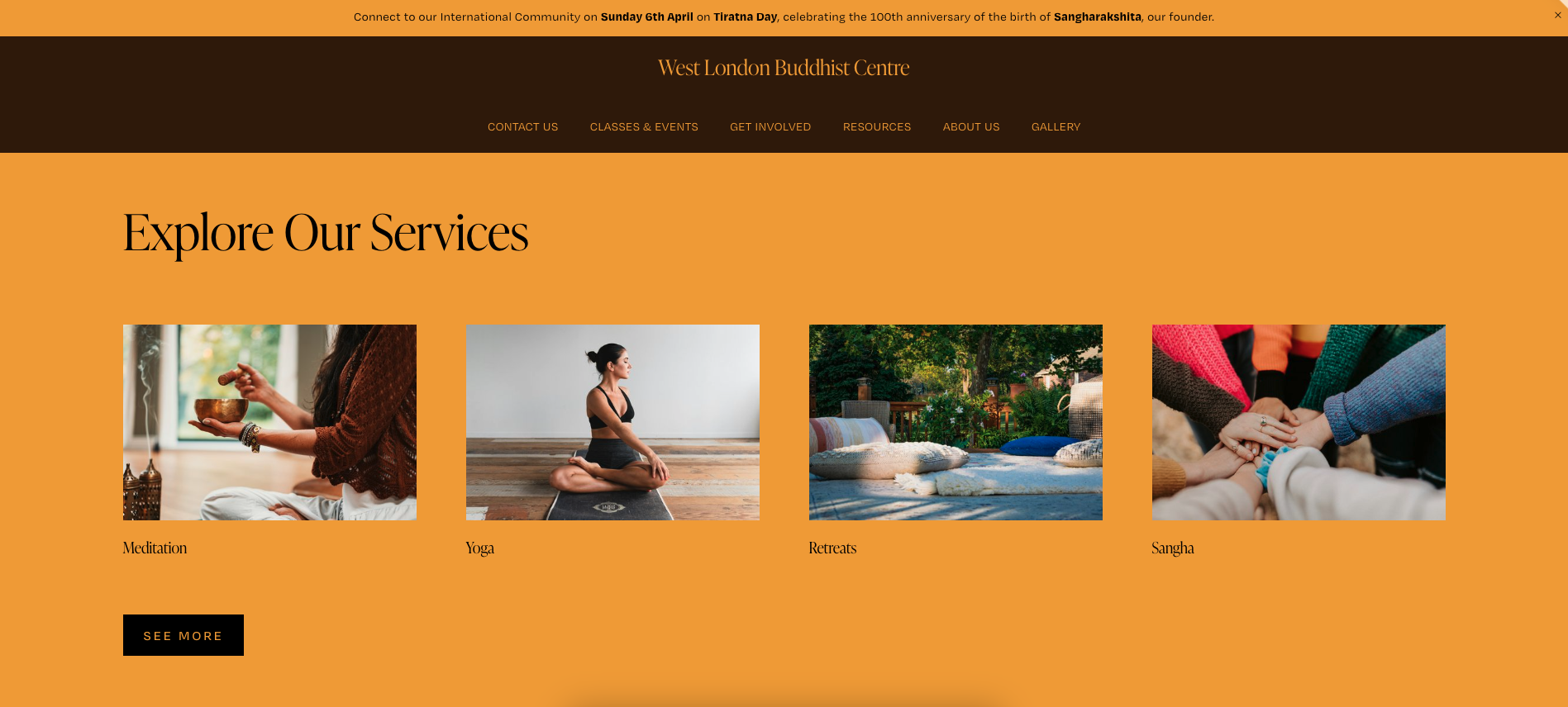
Prototype
Reflection
This project helped me explore how visual design and UX decisions can shape emotional tone as well as usability.
I learned the importance of:
Designing for clarity
Balancing aesthetics with accessibility
Creating stronger content hierarchy