Improving event visibility and increasing bookings.
West London Buddhist Centre
HOMEPAGE REDESIGN
2025
A conceptual homepage redesign for the West London Buddhist Centre aimed at improving event discovery, navigation clarity, and overall engagement.
Overview
Context:
The homepage of the West London Buddhist Centre serves as the primary entry point for individuals exploring meditation for the first time, as well as returning community members booking events.
Audience:
Practicing buddhists and newcomers
Goal:
Redesign the homepage to reduce cognitive overload, clarify beginner pathways, and improve event booking visibility.
Deliverables:
Redesigned homepage (mobile responsive).
Tools:
Figma, Canva, UnSplash
The Problem
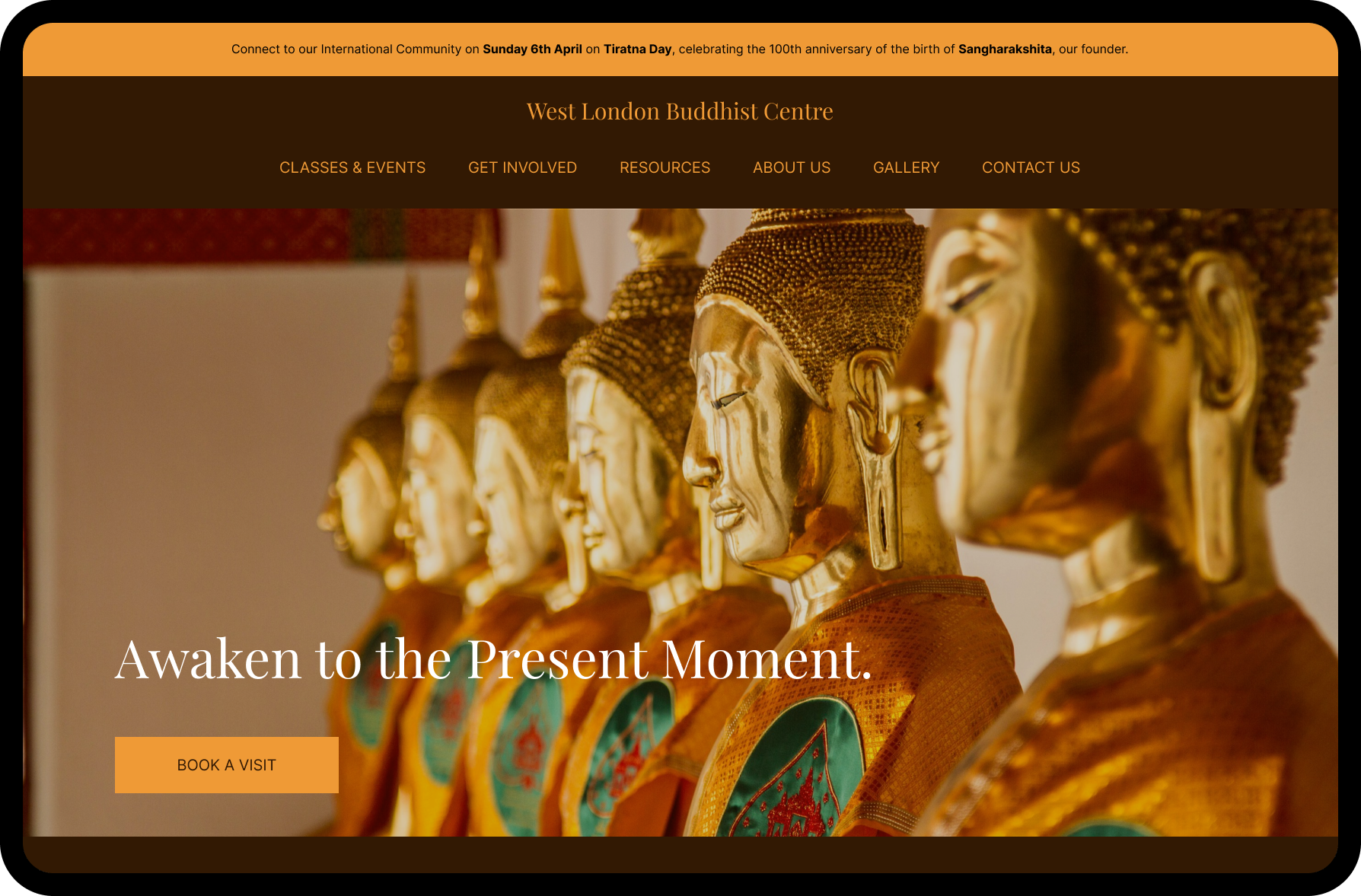
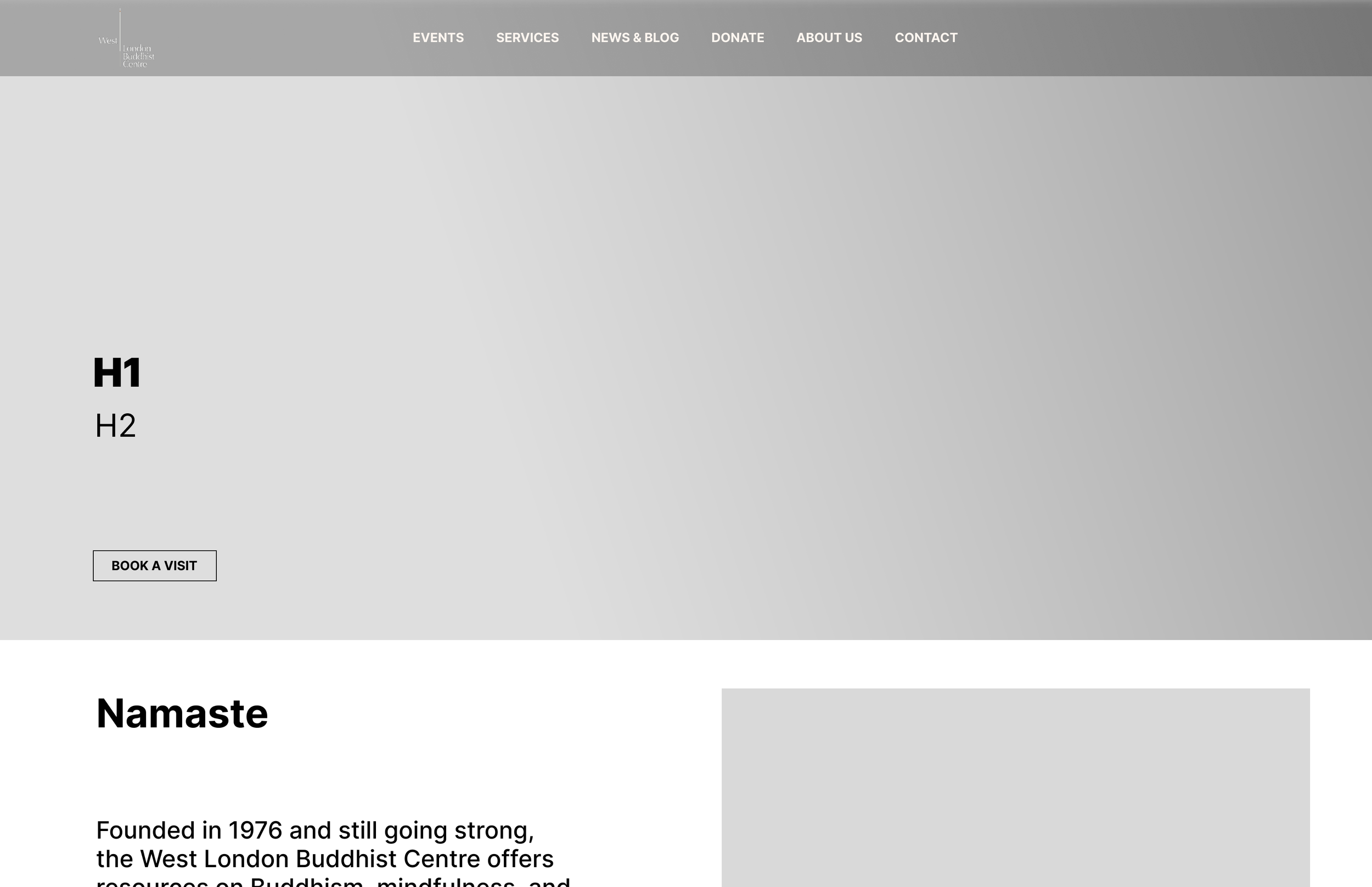
Original hero and navigation above the fold on desktop.
A UX audit of the existing homepage revealed:
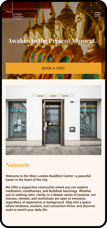
Unclear value proposition in the hero section
Navigation that did not prioritise beginners
Weak calls to action
Dense content and inconsistent typography hierarchy
Emotional tone that felt institutional rather than welcoming
First-time visitors lacked reassurance and direction.
Original hero and navigation above the fold on mobile.
Users
The findings from my brief user test on the homepage with five test users. I documented how they responded to locating select information on the homepage.
The Curious Beginner
Little knowledge of Buddhism
Unsure whether classes are suitable
Needs reassurance and clarity
Key insight:
Beginners need emotional safety and clear direction before engaging further. Don’t overwhelm. What do you want them to do?
The Returning Member
Wants quick access to events
Mobile-first browsing behaviour
Seeks efficient booking flow
The Solution
MVP
Clearly explain offerings within the first scroll
Guide new visitors towards beginner-friendly actions
Increase clarity of offerings (meditation, yoga, Buddhism)
Improve navigation for new users and mobile users
Reflect the warmth, inclusivity, and calmness of the centre
Encourage event signups and visits
Mid-fid wireframe of hero section on desktop.
Mid-fid wireframe of hero section on mobile.
Visual Direction
Soft, neutral colour palette inspired by buddhist monk attire
Calm, readable typography with clear hierarchy
Minimal imagery used intentionally to support tone
Accessibility considered through contrast and spacing
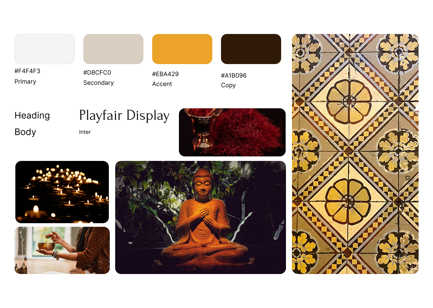
Moodboard
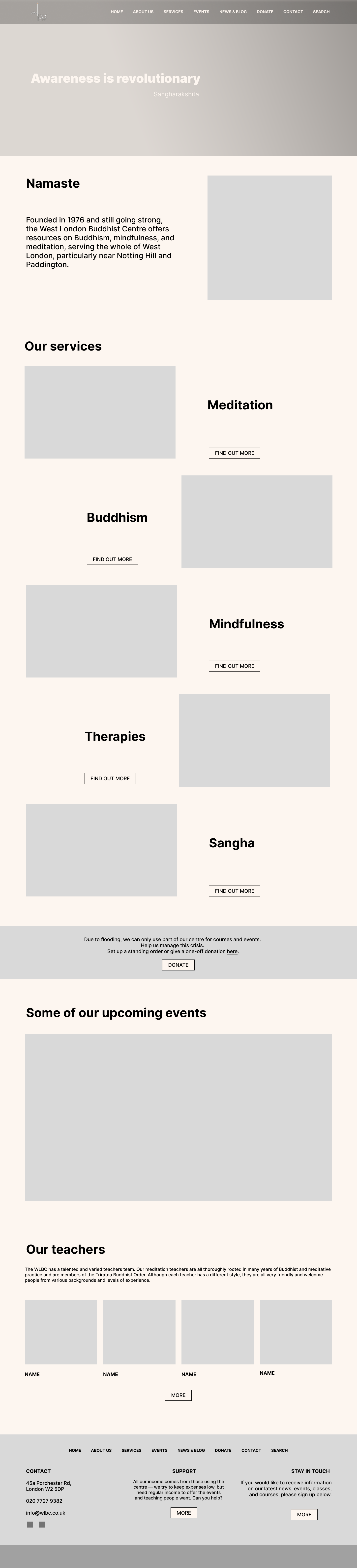
Final Design
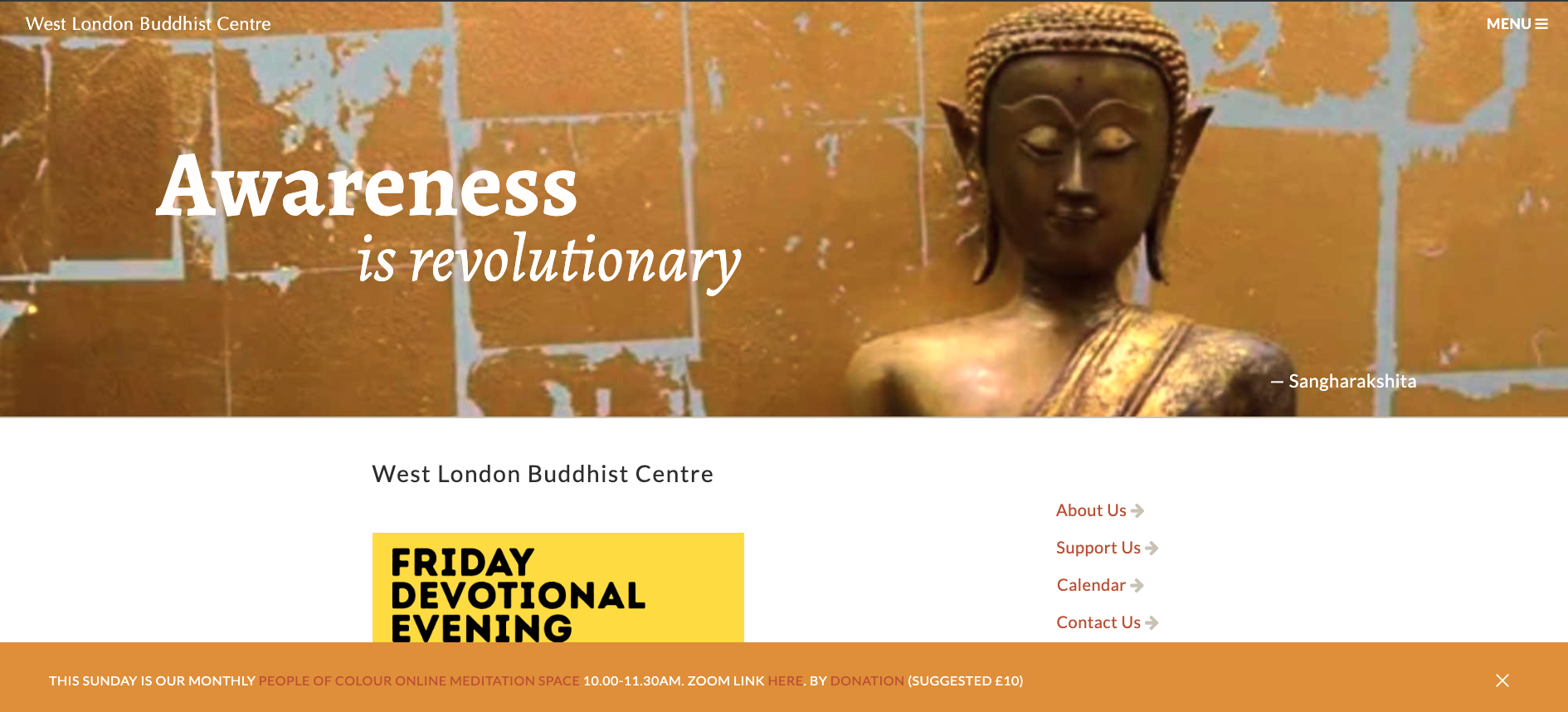
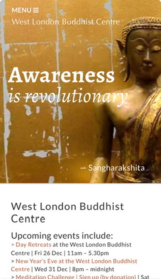
The final design presents a calmer, more intuitive homepage that clearly guides new and returning visitors
Top navigation menu prioritises the most important options for new users
Visual direction is cleaner, memorable and reflects the nature of the organisation
Homepage is now mobile responsive
New hero on Macbook
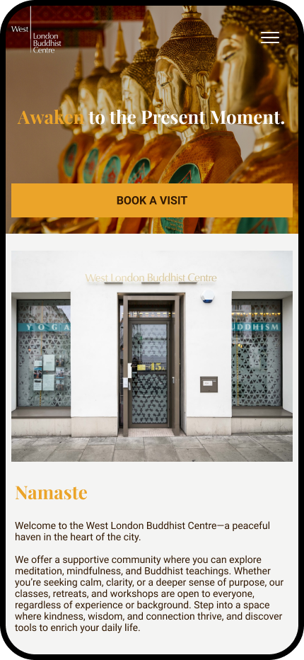
New hero on mobile
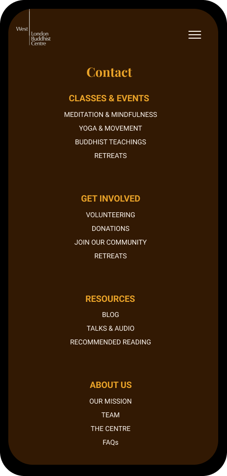
New mobile footer
Reflection
This project helped me explore balancing calm visual design with clearer event-focused UX patterns.